Your first question may be, “Are these books of yours published?” to which the answer is, “Not currently, no.” Your second question may be, “Then, why do they have covers?” Here’s the answer:
I’m painfully aware that outside the self-publishing world, authors almost never have any input on the jacket designs for their books. Published authors of my acquaintance have related horror stories about how their publishers came up with covers with no relationship at all to the content or that made their books seem banal, ridiculous, or inappropriately lurid.
A while back, I briefly explored the possibility of self-publishing my novels, although I eventually abandoned that idea for various reasons (after only printing a handful of copies through a print-on-demand service, mostly for friends and family) and decided that my best bet would be to eventually find a proper publisher. However, my flirtation with self-publishing had one important side effect: It led me to design the jackets as I would like to see them.
With Deidre Tanaka Does Not Speak Japanese, I wanted the logo to mix English letters (romaji) and Japanese characters (hiragana and kanji). After some trial and error — and a helpful correction from a friend of an embarrassing error in my hiragana (I haven’t taken Japanese since college, which was quite a while ago now) — I came up with this:  (The fonts here are Caviar Dreams, which is copyright © 2009, 2010 Lauren Thompson (Nymphont); and the UmeFont family, which is copyright © Horai Wataru.)
I then had the idea of laying this logo across the face of a woman who could be the photographic stand-in for Deidre herself. This was challenging, because not only do I not know anyone who fit the bill, I wanted a particular expression that conveyed something about the character.
After a lot of hunting, I found this 2007 photo by Yu-Cheng Hsiao (a.k.a. Swanky). The subject is Swanky’s younger sister. She’s younger than Deidre, but she has an array of highly Deidre-esque expressions, and this one in particular lent itself to the concept I had in mind. I contacted Swanky, explained what I was doing, and asked him if I could use his photo, to which he and his sister graciously agreed. The next step was to develop a complete design:

The “peek-a-boo” effect with her eyes and the translucent band worked out about as I’d hoped. I then came up with the idea of the alternating text color for the spine. Here’s the completed cover:

(In addition to the above-mentioned fonts, this design also uses euroference, which is copyright © 2000 Tobias B. Koehler, and the Liberation Fonts (version 2.00.1 or later), which are copyright © 2012 Red Hat, Inc., used under the SIL Open Font License, Version 1.1. Liberation is a trademark of Red Hat, Inc. registered in U.S. Patent and Trademark Office and certain other jurisdictions. Red Hat is a trademark of Red Hat, Inc., registered in the United States and other countries.)
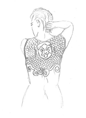
Dharma Bum and the Shield of Athena (since re-titled The Shield of Athena and the Ghost of a Chance) was a stickier issue because I had a very strong image in my head that I feared would be beyond my capability to execute. I wanted an image of Morgan, the protagonist, with her back to the reader, showing off her tattoo of the Aegis, the shield of Athena, which is a major facet of her character. Here’s my original sketch: 
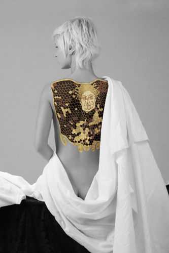
I wasn’t sure how I was going to pull it off. I’m not a great photographer, and finding a model was a problem. Happily, after a lot of digging and fruitless searches for alternatives, I stumbled onto this 2008 photo by Frank Nettekoven. This was eerily close to the image I had in my head, and Frank’s model looks a lot like I’d envisioned Morgan. Her hairstyle is not quite what I imagined, but it’s actually of quite a similar length and shade.
So, I contacted Frank and got his and his model’s permission to use the photo for this project. I then created the Aegis “tattoo” electronically (based, as in the book, on a section of the 1898 Gustav Klimt painting Pallas Athene, although I had to extrapolate or interpolate details not depicted in the painting) and then layered the two together. I decided to do the tattoo in color to make it pop against the black-and-white photo:

I’m not entirely satisfied with the way the tattoo integrates with the underlying photo — it still looks digital rather than like a real tattoo, even after a fair amount of tinkering — but this is nonetheless about 90% similar to the image I had in my head.
Having achieved that, I set out the finish the design. I blew up the “tattoo” image for the back cover and decided that I wanted the title and copy for the front cover and spine to be extremely stark. Here is the result:

(The title font here is OldSansBlack, which is copyright © 2003 Manfred Klein. Other cover elements use the aforementioned euroference and Liberation Fonts.)
And there you have it. While I don’t know what the covers of any future editions may look like, and probably won’t have any say in the matter (I just hope they don’t end up seeming like some deranged romance novel), in my head, they look a lot like this.
(P.S. It should probably be noted that none of the font creators listed above have approved or endorsed this use of their fonts, and no such approval or endorsement is implied or should be inferred.)
# # #
Pretty amazing how close the final product matched your initial drawing!